Responsiveness
Fluid Intelligence: How Naomi Scales Across Every Screen Size
In the world of robotics, adaptability is survival. In the world of web design, it’s the difference between a high-bounce rate and a conversion. Most templates use "Fixed Scaling"—they just shrink images until they are unreadable.
Naomi uses Adaptive Logic.
We’ve engineered the template to treat every breakpoint (Desktop, Tablet, and Mobile) as a unique operational environment. Using Framer’s advanced layout engine, Naomi recalculates spacing, font ratios, and image alignment in real-time.
The Adaptive Advantage:
Viewport Awareness: The layout "senses" the browser width and shifts components into optimal positions before the user even notices.
Touch-Input Optimization: On mobile, Naomi’s logic automatically enlarges "Target Zones" (buttons and links) for human interface, ensuring the UX is as smooth as the desktop experience.
Contextual Reflow: Elements don't just stack; they reorganize to maintain the visual hierarchy that makes Naomi premium.
System Status: Adaptive protocols active. Visual fidelity maintained at 100% from 320px to 2560px.

Grace Kaito Nakamura
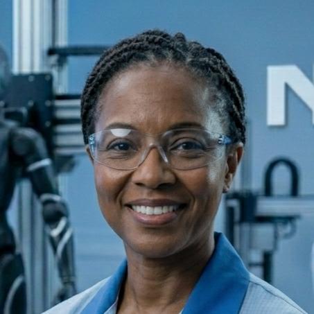
Dr. Elena Okoro

Sarah Jenkins