
Schematics
Responsiveness
Breakpoint Optimization: Maintaining Visual Fidelity in Mobile Viewports
The most common "error" in robotic assembly is a loss of precision at scale. Many Framer templates look stunning on a 15-inch MacBook but lose their "soul" on a 6-inch iPhone.
Naomi’s Adaptive Logic prevents visual decay.
We spent 40+ hours specifically on "Micro-Breakpoints." We analyzed how the robotic textures and high-tech gradients in the Naomi UI behave when compressed. The result? A template that feels like it was designed specifically for the device you are currently holding.
Why Naomi is a "Smart" Template:
Dynamic Typography: We use fluid type scales so your headlines are bold on desktop but perfectly legible—not overwhelming—on mobile.
Asset Economy: Adaptive Logic also means "Selective Rendering." On smaller devices, Naomi prioritizes the most critical visual data to keep the interface clean and the performance high.
Motion Stability: Our scroll-transforms and interactions are calibrated to remain buttery smooth, even on lower-powered mobile processors.
Conclusion: When you deploy Naomi, you aren't launching a website; you're launching a responsive ecosystem that respects your user's hardware.

Dr. Elena Okoro
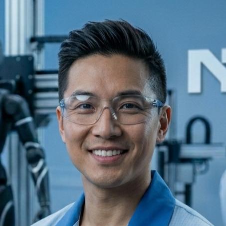
Marcus Chen